Infrastructure · Brand & app
iCues
Infrastructure professionals belong to several organizations, each posting events on its own website and in its own emails. We designed iCues, an app that gathers those events into one feed, from the two-shape mark to the launch deck.
Project Overview
iCues is for civil and infrastructure professionals who belong to several industry organizations. Chapter dinners, conferences, webinars, and training seminars are where engineers learn and grow their careers. When an event slips by unnoticed, they lose a chance to earn continuing education credit, meet people who could hire or refer them, and keep up with their field. The app had to make finding the right events feel effortless. To earn a place on an engineer's home screen, the brand also had to look as solid as the industry it serves and still stand out among dozens of other apps.
Our Role
Visual identity
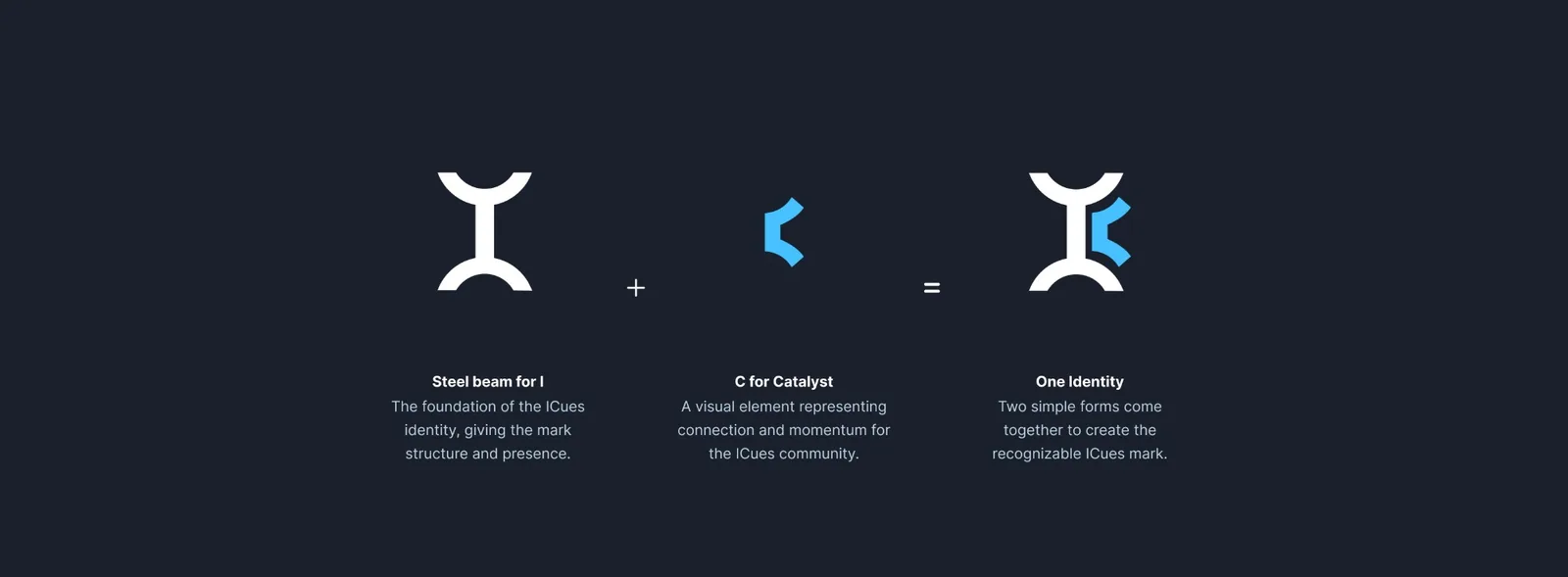
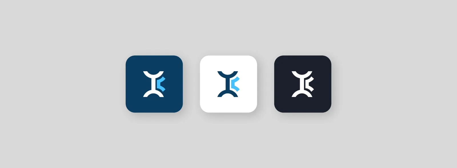
The mark combines a steel beam for the I, a nod to the structures its users build, with a blue C for catalyst. The app icon comes in three colorways: navy, white, and charcoal.
The app
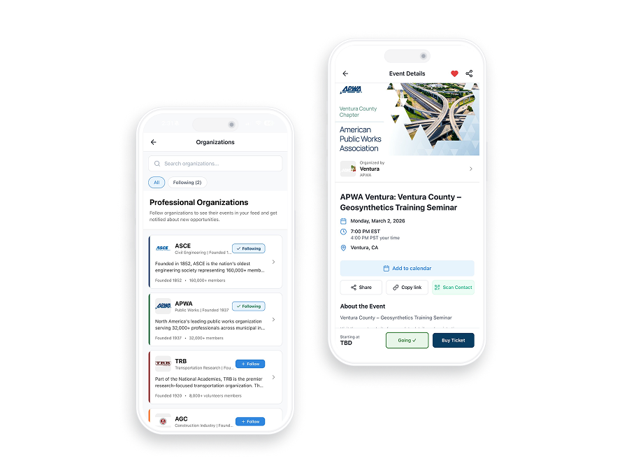
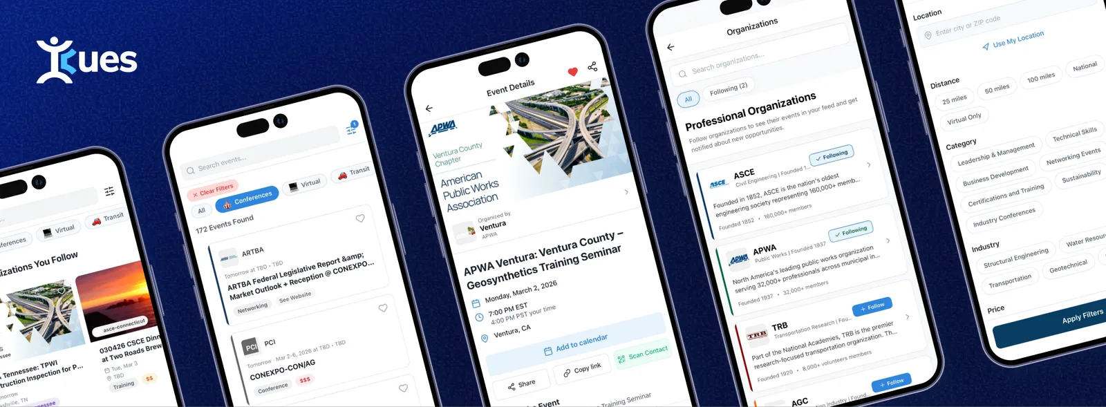
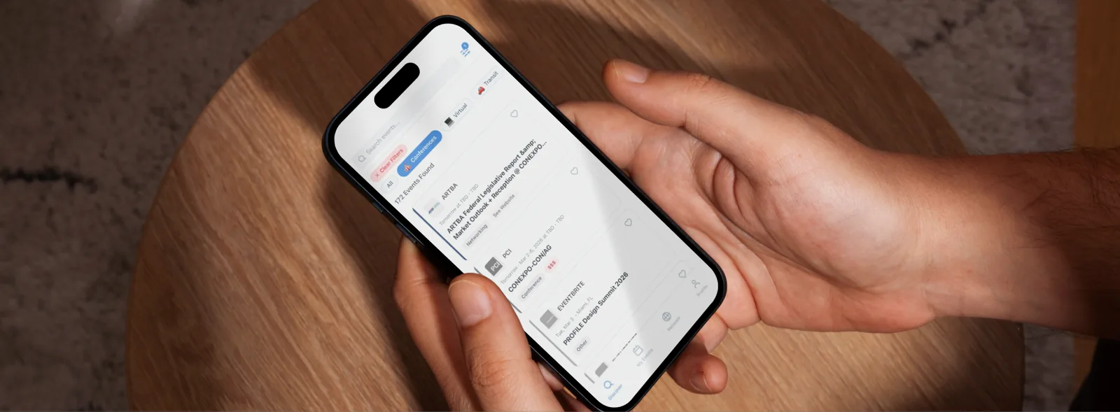
The app answers one question fast: which events are worth my time? The feed gathers every event in one place, and filters narrow it by what matters to the person scrolling. Each event card shows the organizer, the date, the format, and the price at a glance. Engineers can follow the organizations they belong to and search by location to find events nearby.
The launch
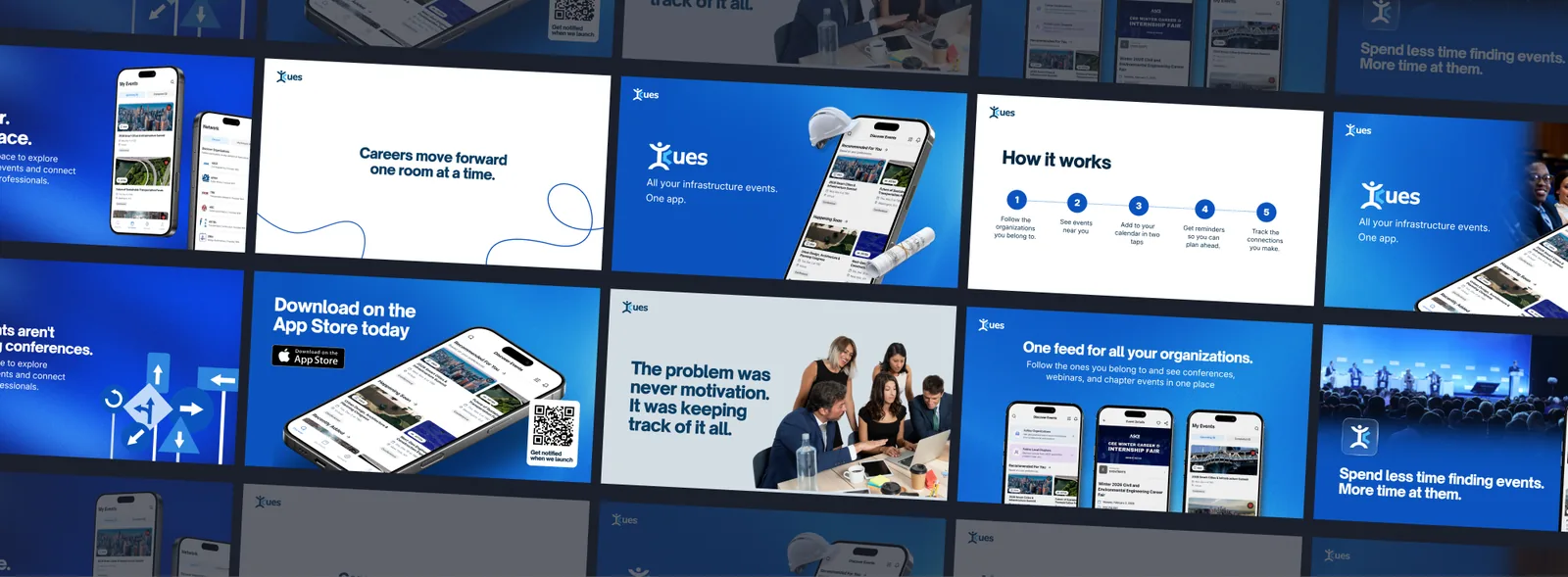
We built a launch deck that explains iCues in five steps, ready to share with anyone who asks about the idea.
Impact & Results
Engineers now have one feed to check before their week fills up. That feed, the rest of the core screens, and the launch deck all share one look, making iCues feel like a finished product from the first pitch to the first tap. The same screens set the pattern for every feature that comes next.

Keep looking
More case studies
Government & Regulated Industries
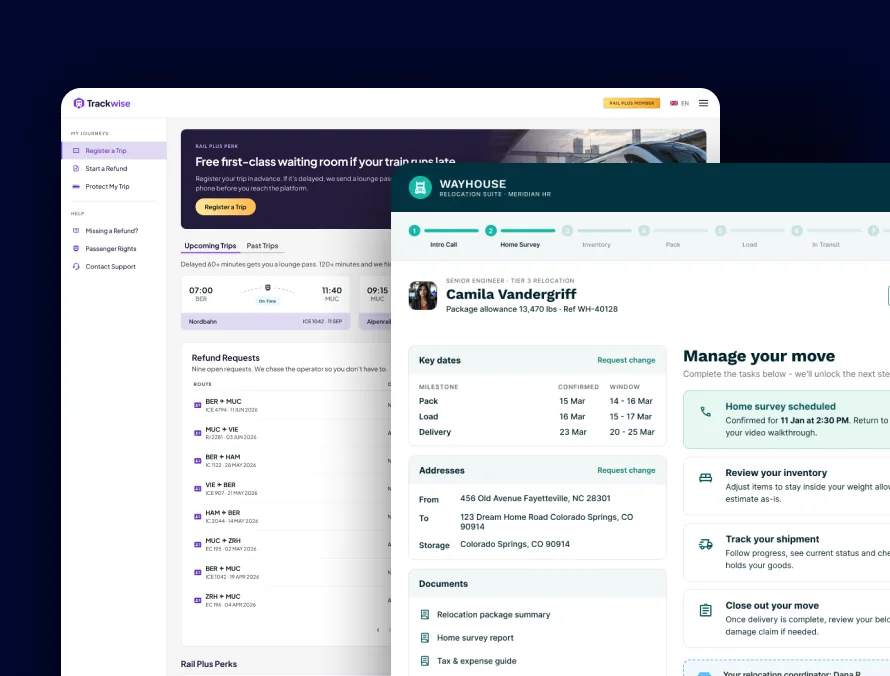
Accessible products for government and regulated teams, from a relocation platform for military families to a flight-claims portal.
Read case study →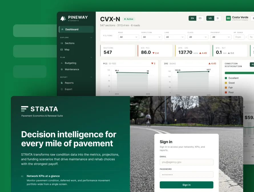
AI for Civil Engineering
Decision-support software for pavement, highway and runway teams, built on the standards they already follow. Legacy rebuilds match the old results run for run.
Read case study →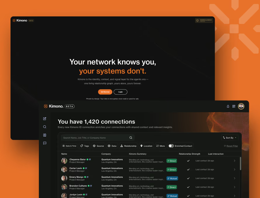
Kimono
We reworked Kimono from the first sign-up screen to the settings page, so people reach their contacts in under two minutes and can find their way around once they are in.
Read case study →Let's talk
Launching an app and need the brand to match the product?
We'll design the mark, the core screens, and the launch to look like one product from day one.