Hospitality · Brand & website
Rest and Roam Rentals
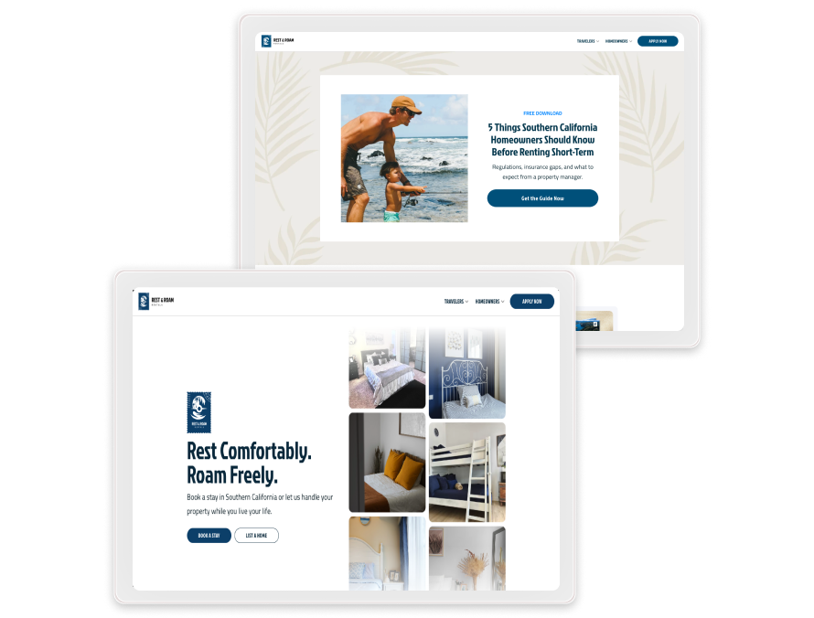
Rest and Roam Rentals manages short-term rentals across Los Angeles and Orange County. It serves travelers who need a place to stay and homeowners who want their home run for them. We designed one brand to speak to both, from the stamp mark and the website to a trifold brochure.
Project Overview
Rest and Roam Rentals serves families, pet owners, and remote workers looking for a California stay that feels easy. The homeowners it works with want income from their property without handling guests, cleaning, or pricing themselves. The company needed a brand that gets guests excited before they arrive. It also had to give owners confidence that their house is in good hands. We set out to build that feeling into the mark, the website, and every printed piece.
Our Role
Visual identity
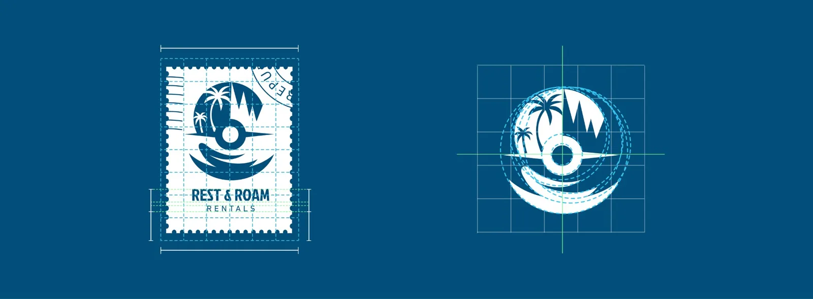
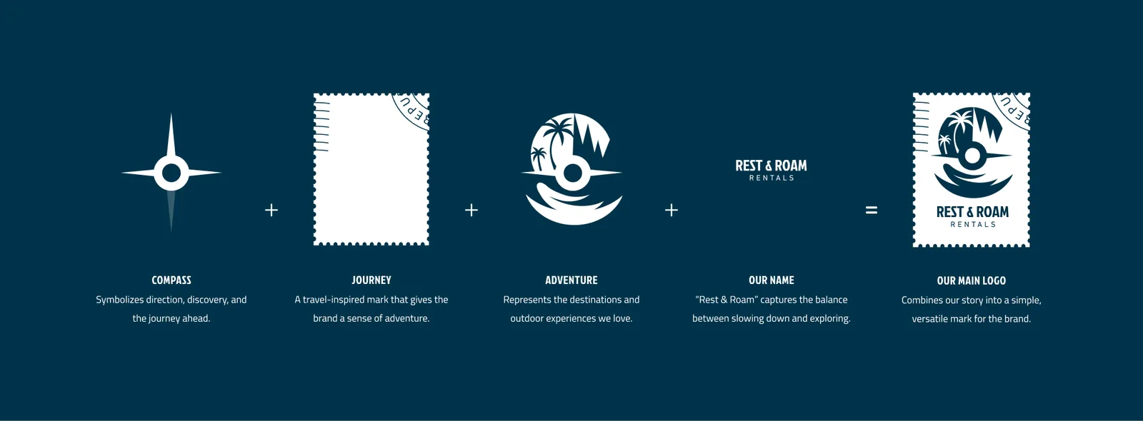
The brand had to feel like a California trip before anyone packed a bag. The mark joins a compass for discovery, a postage stamp for travel, and palms and a wave for the coast. Deep ocean blue sets a calm, unhurried mood. White keeps every page clear and easy to read, and sandy tan adds the warmth of a day at the beach.
For travelers
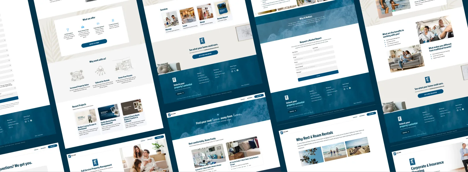
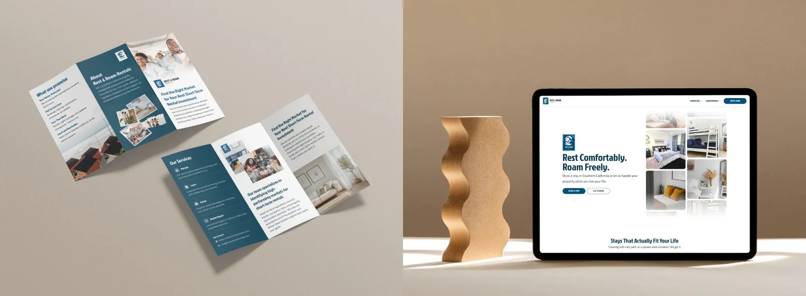
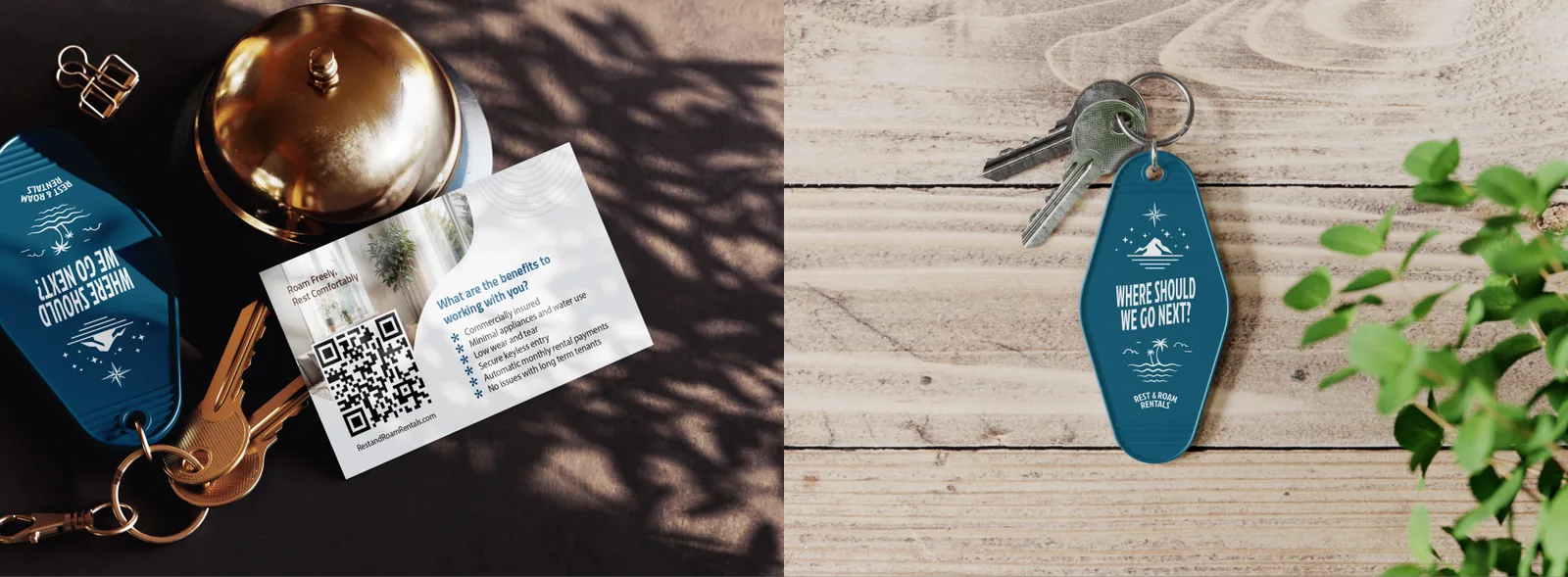
Guests should feel relaxed from the first click. The website keeps browsing and booking simple. At the door, motel-style key tags ask, "Where should we go next?" and turn check-in into the start of the adventure.
For homeowners
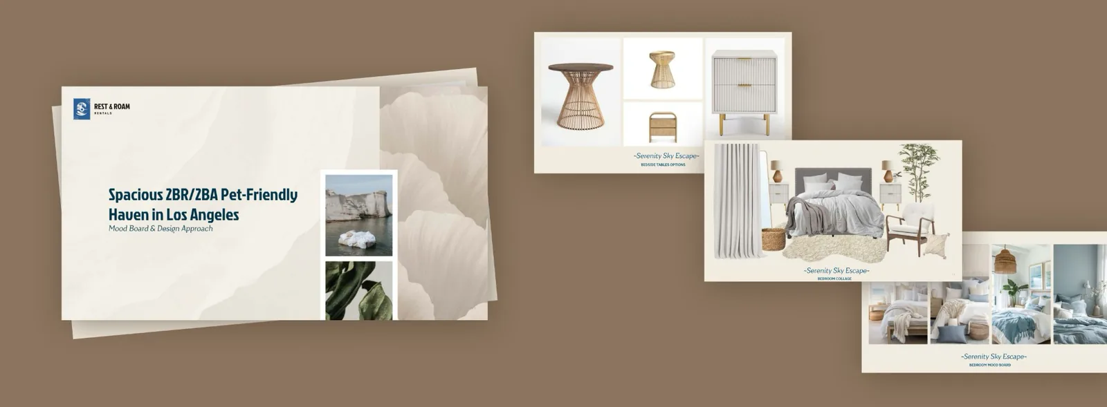
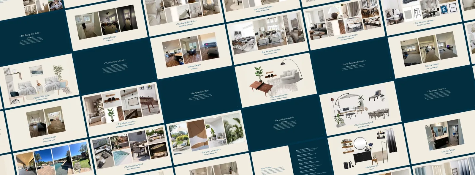
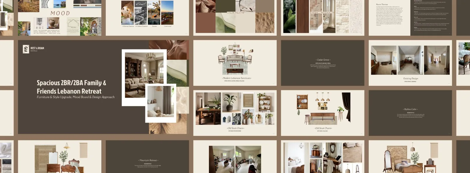
Owners need trust more than charm. Their side of the website lays out the four services, shows recent home transformations, and offers a free guide to short-term renting. A trifold brochure and business cards carry the same story into meetings. Interior design options show owners how their new rental could look, room by room.
For social
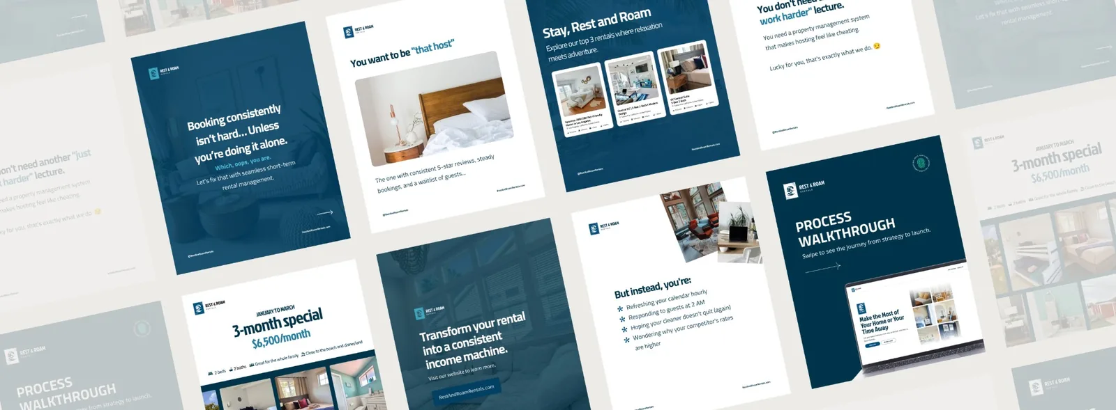
Posts speak to would-be hosts in the same calm voice and show how the team takes the work off their plate.
Impact & Results
Travelers now find a California stay that feels like a vacation before they book. Homeowners find a partner they can trust with their home. The website gives each of them a clear path, and one visit can turn into a booking or a new home to manage. With the mark, colors, and voice set, every new listing, brochure, and post looks like it belongs.
Keep looking
More case studies
Government & Regulated Industries
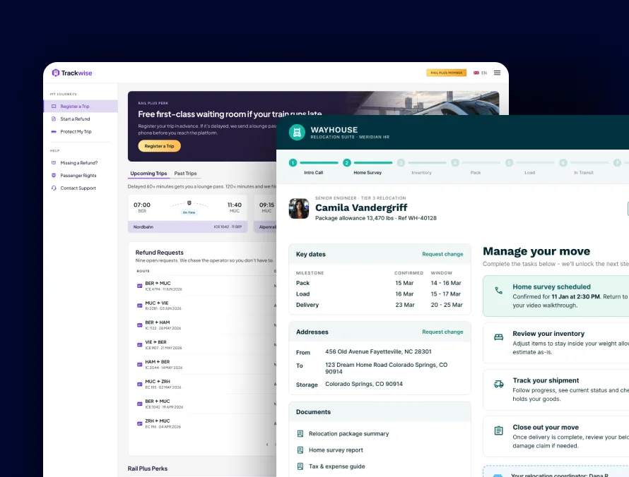
Accessible products for government and regulated teams, from a relocation platform for military families to a flight-claims portal.
Read case study →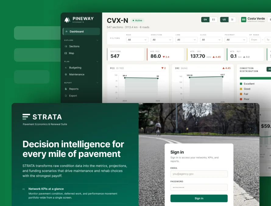
AI for Civil Engineering
Decision-support software for pavement, highway and runway teams, built on the standards they already follow. Legacy rebuilds match the old results run for run.
Read case study →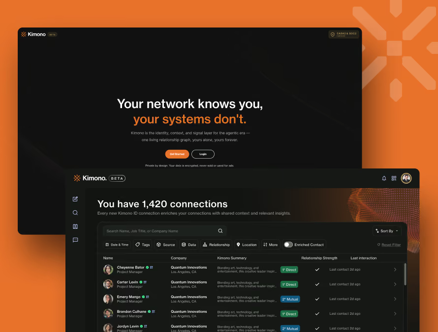
Kimono
We reworked Kimono from the first sign-up screen to the settings page, so people reach their contacts in under two minutes and can find their way around once they are in.
Read case study →Let's talk
Does your brand need to speak to two audiences at once?
We'll design one identity that works for both, from the logo to the last printed piece.